Recently, one of our project designers completed a kitchen renovation in the Denver Tech Center area. The overarching goal of the project was to open up the space and create a better flow while matching the overall feel of the traditional home. In addition, the homeowner wanted to infuse a bit of personality into the space using color. We sat down with Linda McLean, CKD to find out more about how the project evolved and what she loved best about the project.

Tell us about the project and what the client’s wishes were for the space.
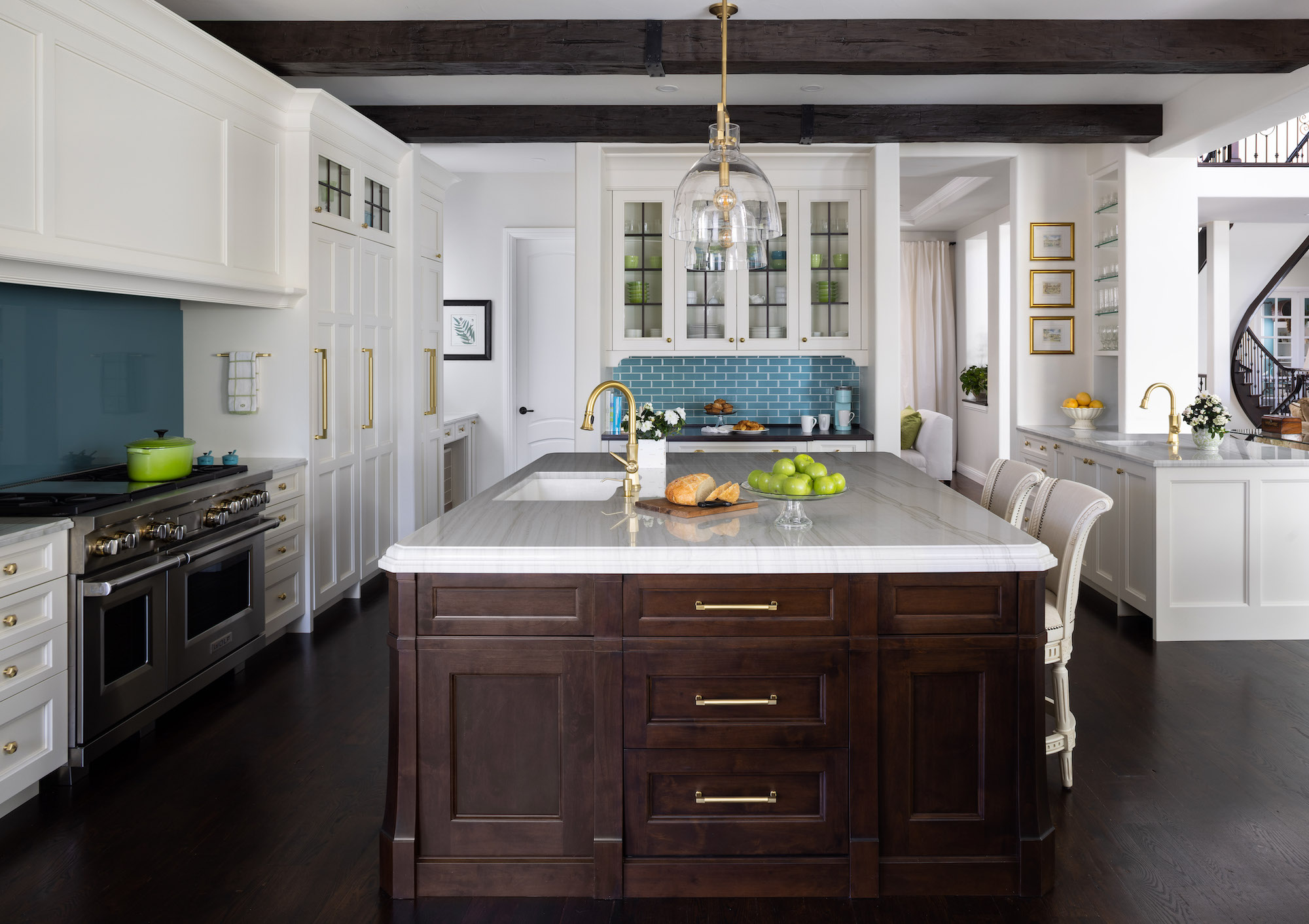
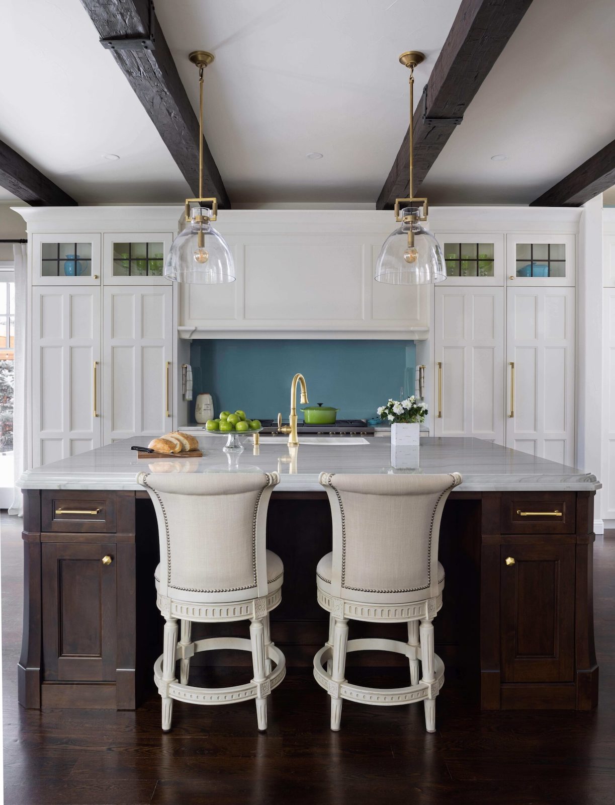
LM: The client’s main goal was to open the space up and create better aesthetic compatibility and flow from the kitchen to the rest of the living areas on the main floor. Originally, there was a floor-to-ceiling wall where the bar is now. By removing the wall, we created a focal point on the range elevation highlighting the hood and backsplash while drawing the eye over the island and between the white cabinetry. This gives you a balance of different colors, materials, and finishes all while pulling you into the space. The color is there, but not overwhelming or out of place.

With color being such a big part of the overall kitchen’s appearance, how did the design evolve to accommodate the color while still being functional and timeless?
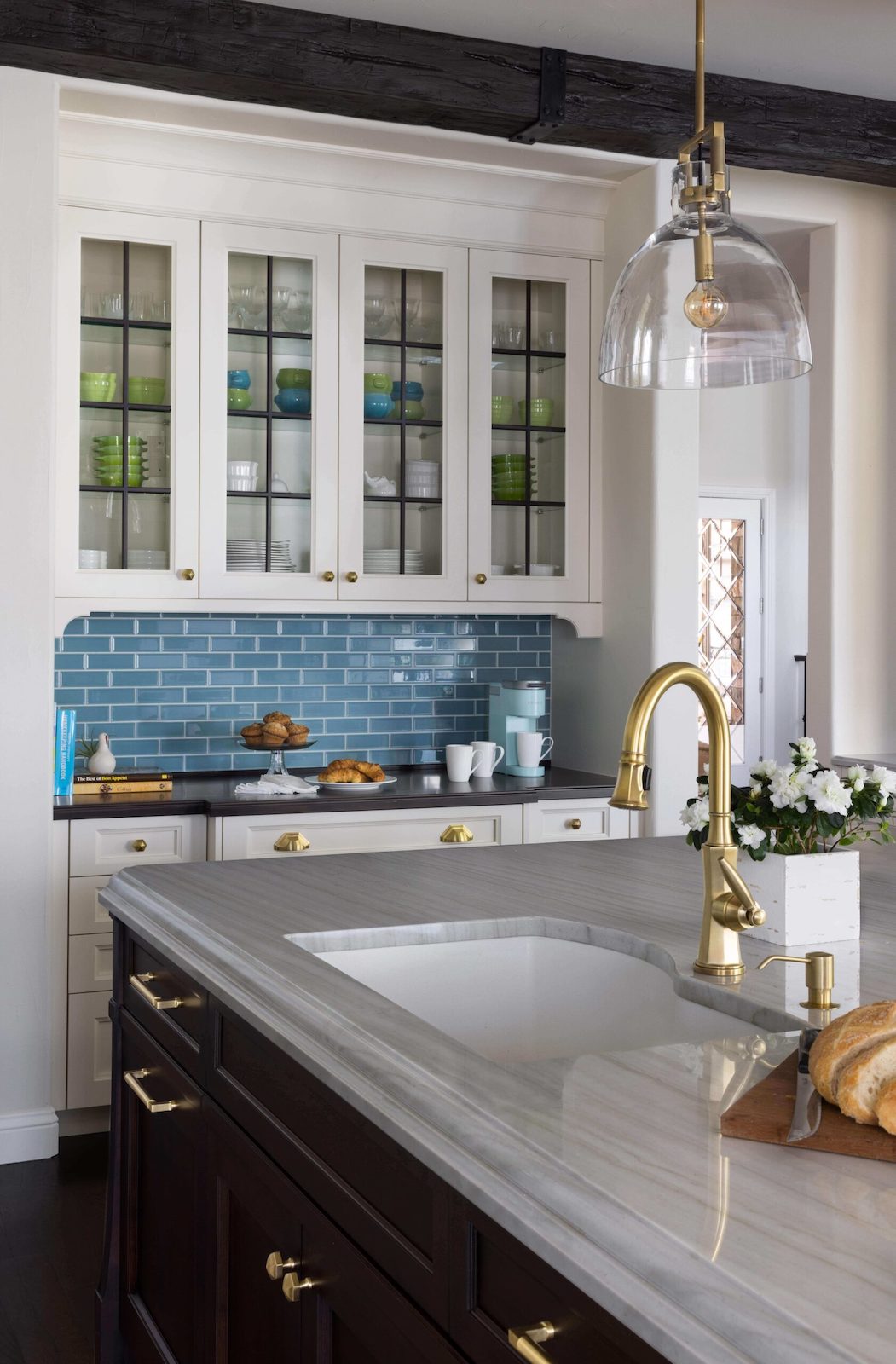
LM: The color was a reflection of the homeowner. She chose the color to match her personality as well as the rest of her home and we integrated it into the design by using a back-painted glass backsplash over the range and the subway tile in the buffet area. The glass over the range is a perfect option functionally as it’s incredibly easy to clean, and the tile brings colored texture into the space in an area where the grout won’t have to be cleaned regularly.
We made sure to keep the rest of the kitchen more neutral, choosing a basic white perimeter and a dark wood island that would complement the beams and the floor. By only allowing the color to shine in two places, the kitchen doesn’t feel TOO colorful while allowing the client to accessorize however she sees fit. This is the key to timeless design, everything in moderation and functional flexibility wherever possible.

What is your favorite part of the kitchen?
LM: The island is my favorite because it is such a furniture-like piece. The kitchen is actually two different brands of cabinetry: Grabill for the white perimeter and Rutt’s Ruskin Series for the island. We wanted to make sure the island was a main character in the design, with the perimeter doing the heavy lifting from a storage standpoint as well as helping to create a neutral backdrop for the backsplash color and island warmth to shine. The corner profiles on the island are continued into the drawers and really give it the exact furniture look the client was after. The blending of the two different door styles helps to set the kitchen off and keeps things interesting no matter where you look.
Have you decided it’s time for a kitchen or bathroom renovation?
Make sure to check out our Kitchen Design Checklist to help plan your project from start to finish. After you download the checklist, browse our gallery for some visual inspiration.
Kitchen Distributors is an award-winning kitchen design team that turns your dream kitchen in Denver, CO to a reality. From concept to full-service construction, we take care of all the details of your future kitchen design, so you can focus on what matters.

