Linda McLean, Kd. Project Designer, recently completed a multi-bathroom renovation in Greeley, Colorado. Given the location and southwestern architecture of the home, the goal was to re-configure each space to create better flow while bringing in earth-tones and natural materials to complement the exterior. On Linda’s list to gut and remodel were three bathrooms: the basement bathroom, primary bathroom, and powder room. We sat down with Linda to take a deep dive into the grand transformation of each bathroom, looking at the evolution from the design decisions made in each space to how she took the bathrooms from outdated to spa-like.
Primary Bathroom
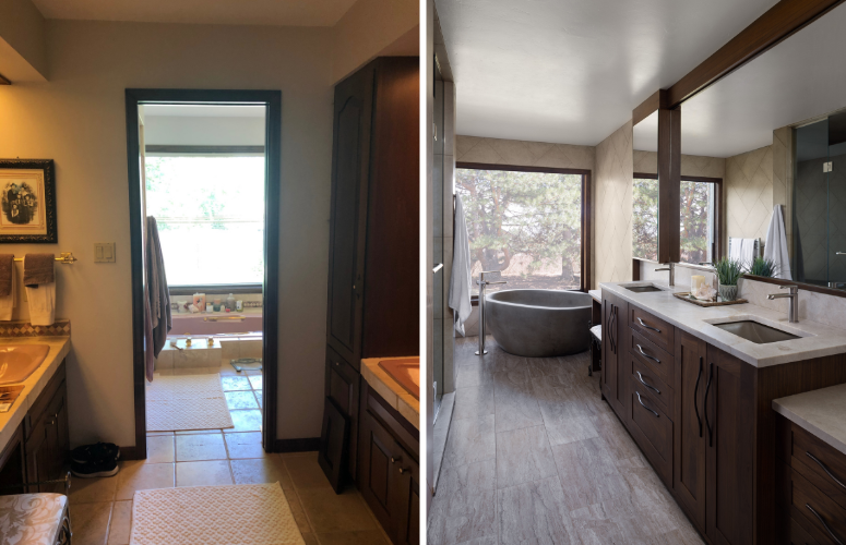
Tell us about the primary bathroom and your approach to the design.
Linda: As we can see in the before picture, the primary bathroom was very segmented originally. It had an entrance from the hall that led into a make-up area (on the left) then there was a door to get into the rest of the bathroom which housed the shower, toilet, and sunken tub. All of the hardware was gold and the sinks, toilet, shower, etc were pink, which were not fitting for the home.
I’m a strong believer in the primary bathroom having a separate water closet, so incorporating one became the most important factor when deciding how to lay out and update the space. To achieve this, we removed the wall that separated each part of the bathroom and turned it into a galley-like layout. With this change, we were able to create space for a water closet to the left of the bathroom door before the shower. In addition, the new layout allowed us to expand the shower by double its original size, install a custom vanity inclusive of a seated make-up area, and capitalize on the view with a poured synthetic concrete soaking tub by Native Trails.
The materials and finishes used work together to create a cohesive, calming environment that pulls the outdoors in. I especially love the warmth that the rich walnut of the custom vanity, done by Rutt Cabinetry, brings to the space.
Basement Bathroom
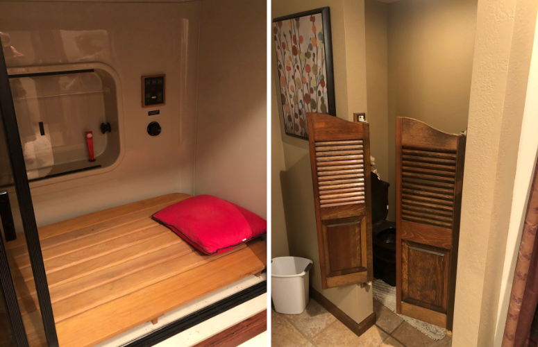
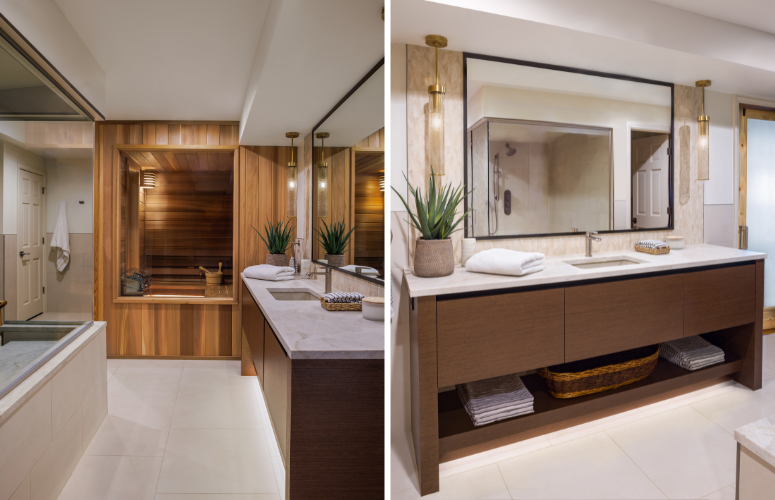
The basement bathroom seems to be the biggest transformation out of the three. Tell us about it.
Linda: The before pictures make it hard to grasp the original layout and what I was truly working with. Originally, it was poorly laid out with a water closet housed behind saloon doors, a very small fiberglass shower, and a 1970s Kohler habitat – essentially an enclosure that contained a platform that could be converted into a steam shower or sauna. I had never seen a habitat like this in person, but the consensus from everyone involved was that it needed to go. The clients expressed interest in using the extra space for a sauna and steam shower of some sort. Upon hearing this, I knew we could configure the space in a way that there would be enough room to make it into a full spa.
It was my first sauna, so I dove into researching the best materials to use and how to make it sexy as it would be exposed. By incorporating a good amount of glass, beautiful natural fir wood, and mood lighting below the floating benches and coved ceiling, the sauna became a focal point. In sticking with the spa feel, we used luxurious, calming materials and finishes, as well as lighting that could be dimmed to set the mood. The tone of the sauna and walnut vanity play well with the soft, natural tile and Taj Mahal Quartzite countertops.
I’m proud that this bathroom is now an escape for our client – a place they can relax in all day if they wish!
Powder Bathroom
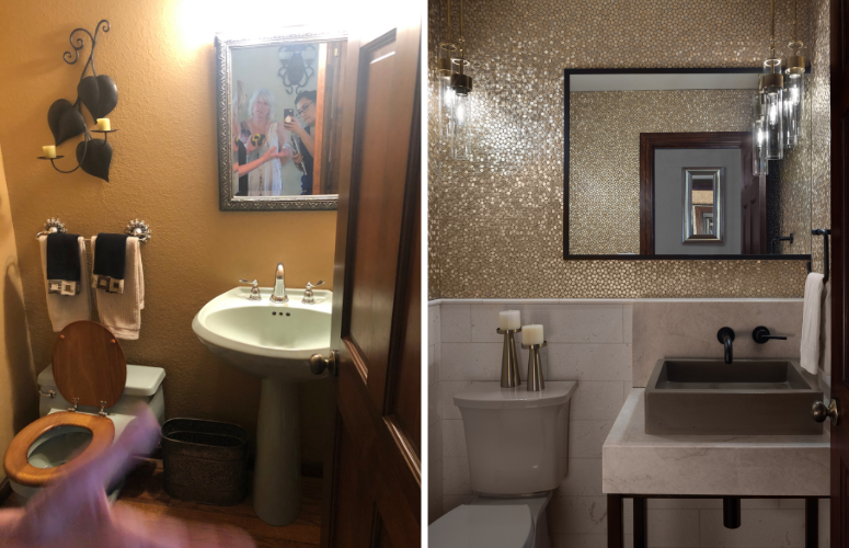
Tell us about the powder bathroom and your approach to the design.
Linda: The powder room was teeny tiny! It was very cramped, very outdated and I felt it was the one area where I could divert from the styling that was done for the house.
Due to the size of the powder and not having the opportunity to make it any bigger, I didn’t want to install a traditional vanity. Instead, I created the illusion of space by floating a countertop with a vessel sink and mounting the faucet on the wall.
The wall tile, lighting and mirror also do a great job of expanding the space and making it feel larger. The gold tile was from Decorative Materials and one I had fallen in love with a long time ago – I thought it would be an appropriate showstopper for this space. At first, the client thought it would come off as too glitzy and glam, but they understood the powder was a good place to have some fun design-wise. Paired with the pendants that were intentionally placed in the corner, the tiles bounce and throw the light around the room to create balance. The custom mirror is three-sided and was also placed to create a mirage of a larger area. The end result is a powder room that makes you want to take in all of its angles and details!
Is there anything else you’d like us to know about this stunning project?
Linda: Yes! The clients were a joy to work with. They are very community-focused and therefore it was important for them that I source from the community and vendors in the area as much as possible. It proved to be a challenge at times, depending on what was needed, but it was a great exercise in supporting local companies and their talents in craftsmanship.
Have you decided it’s time for a kitchen or bathroom renovation?
Make sure to check out our Kitchen Design Checklist to help plan your project from start to finish. After you download the checklist, browse our gallery for some visual inspiration.
Kitchen Distributors is an award-winning kitchen design team that turns your dream kitchen in Denver, CO to a reality. From concept to full-service construction, we take care of all the details of your future kitchen design, so you can focus on what matters.

